Brand guide
The ComplyBard brand
Our logo, colours and type, and how to use them on light and dark backgrounds. Download what you need, or take the full kit.
The mark
A C and a check
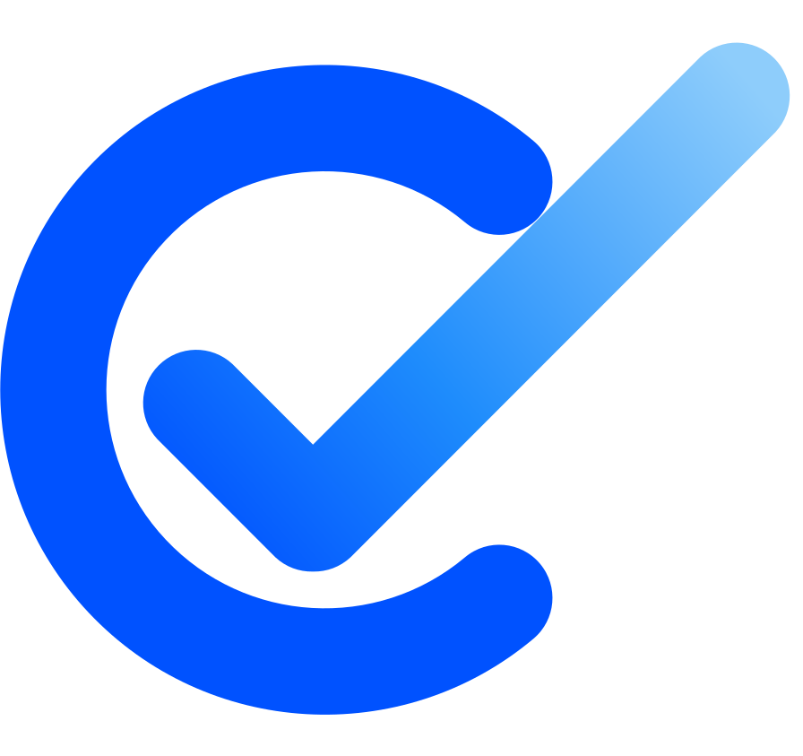
The mark is an open C with a check breaking out through it. It reflects how ComplyBard works: training keeps running on its own, through lessons, quizzes and refreshers, and every cycle ends with people passing.
- 1The C. Compliance that keeps running. An open ring in solid Blue, like a cycle that repeats each year.
- 2The check. The pass. It breaks out through the opening, fading from Blue to Mist as people move forward.
Drawn upright with even, rounded strokes. Keep the check and the opening of the C as they are: don't close the C or move the check inside it.
Logo
Logo versions
Use the full-colour logo wherever you can. Choose the version that matches the background: dark wordmark on light, light wordmark on dark.
One colour, white
On Blue, the Flow gradient or busy imagery where the colour mark would disappear.
Mark and icons
Mark, app icons and favicon
Use the mark on its own when space is tight or the name is already on the screen. At 24 pixels and below, use the favicon tile.













Spacing
Clear space and minimum size
Keep a clear space of x on every side, where x is half the height of the mark. No text, edges or other logos should enter this area.
Light and dark
Pick the version for the background
The mark keeps its colours in both modes. Only the wordmark changes: Ink on light, Snow on dark. On Blue or the Flow gradient, switch to one-colour white.
Misuse
Please don't
The logo only works if it looks the same everywhere. Use the files on this page as they are.
Colour
Colour palette
Blue means “do”: it marks the main action on every screen. Ink carries the words. Sky and Mist appear only in gradients and soft highlights.
Blue scale
Tints for fills and hover states, shades for pressed states and text on tints. 600 is Blue.
Gradients
In dark mode
Light
Background white or Cloud, text Ink, links Blue 600.
Dark
Background slate 950, cards slate 900, text white, links Blue 300. Buttons stay Blue 600.
Typography
Plus Jakarta Sans
One typeface for everything, from the wordmark to lesson text. It's open source and free on Google Fonts.
Lesson 2 of 5
Voice
Calm, clear and encouraging
We help people learn rules they have to follow. Our words should make that feel manageable.
- Your course is ready. 5 lessons, about 2 hours.
- You scored 90%. Lesson 3 is unlocked.
- Only you can see this.
- Processing complete! Content generation successful!!
- FAILED. Retry quiz.
- Leverage synergies across compliance verticals.
- Talk about outcomes. Say what people get, not how it's made.
- Sentence case. Headings don't end with a full stop.
- Write it as ComplyBard. One word, capital C and B. Never Comply Bard, COMPLYBARD, complybard or Complybard.